Wednesday, 26 May 2010

££

so i had the dreaded meeting today that i've been worrying over and finally met fee
and it was sweeeet!

eight is my now my new magic number!
from june 8th these four lucky prints of mine will be available to buy from mrs jones' shop!

this is the craziest, but most exciting thing ever!
so happy right now.

just got to give them titles now, these are possibles, let me know what you think...

sauces, le tigre, nachos, hornblow

Monday, 24 May 2010

£

this is what i'm taking to show 'mrs jones' on wednesday, i think.
good/bad?

Tuesday, 18 May 2010

H

take me home, i'm homesick

Sunday, 16 May 2010

15

Project 15 - personal made public

we had to write our own brief to identify a project/theme that reflects some personal considerations or areas of interest or focus.
we are then meant to use this as a starting point for our own self directed work for our last project.

i chose a working title of 'people don't listen they look'
it's inspired by my new love for posters

i've been looking at the work of 'Atelier Populaire' (popular workshop) which is a group name for protesting students who occupied Paris'most distinguished and conservative art school, L'Ecole des Beaux-Arts in 1968. they created posters almost everyday for a month and a half. printed daily and then each evening they'd cover the Left Bank with their new designs. theses posters had to be generated quick as most posters were being ripped down almost as soon as they were out up.

my dream is to set up a collective, i've found this group to be so inspiring.


poster number one:

using the oscar wilde quote
"the only thing to do with good advice is to pass it on. it is never of any use to oneself."

i used the idea of homemade help posters, were people attach their contact details to the bottom of the page, then you can tear
them off and take one with you if you like. but instead of details i made the "good advice" something people could tear off and take, keep
or pass on.


poster number two:

"life's greatest accomplishments are those that at first seem impossible"

the first time i tried a chinese finger puzzle, i thought my fingers were gone forever.


poster number three:

"the single, biggest problem with communication is the illusion it has taken place"


poster number four:

for all the illustrators, ha!

"everything big starts little"


poster number five:

"confusion is only a matter of doubt before you leap forward using your decision making power"


poster number six:

two cherries on top

"always be a little kinder than necessary"


14

project 14 - wake up call!

we had another poster project.
(as much as i moan about them, these are now my favourite!)

we have to use type and image to design a powerful poster that related to an issue chosen from a list we were given.
our poster had to be black and white and a1 in size

i chose to do 'nutrition - forget celebrity chefs and posh restaurants, the average British family do not eat together regularly and can't be bothered to cook healthy food'

i did a bit of research and found a shocking fact that '60% of families don't eat together on sundays'
we were told our posters target audience was us, our class.
so using this fact i decided to design a poster to encourage university students to remember to go back home and visit.
my favourite meal of all time is sunday dinner, which is probably way this fact stood out so much for me. i used the the thought of going home for a sunday dinner for my imagery and the stereotypical idea that many students don't eat as well as at home so many must miss home cooked meals.

and also with some help from Bill Withers here and his song 'aint no sunshine when she's gone' created my poster.

(underneath the imagery is my found fact and the tag 'take a trip home')

13

project 13 - anthology of a city

we have to use our time on our study trip to gather, generate, record, create, produce and correlate source material from the city we explored for one week only.
the work from everyone will be used to make a 'digital wall' that will be published online to coincide with the degree show.

the city i went to was Amsterdam

this is my image


it was inspired by the beautiful blue and white pottery that i saw and loved, prostitution and food.

Thursday, 6 May 2010

12

Project 12 - visual signifiers - an introduction to semiotics. the science of signs
Joint Graphics/Illustration.

Group project with Pippa and Alex

we worked in groups of three and whilst on our trip to Amsterdam we were asked to identify and produce visual signifiers for chosen subjects from a list of topics.

the words we chose as a group were:

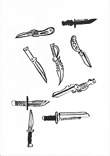
violence
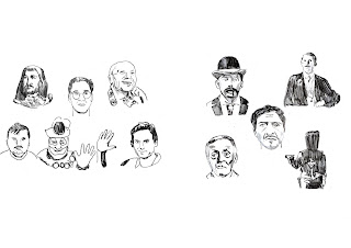
ritual
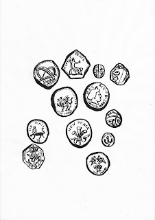
passion
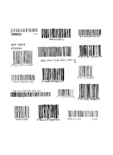
consum
ption
finality

we decided to make a zine
we ended up giving it a rough homemade feel, printing our images on thin cartridge paper
i really liked our final piece, even though it was major rush at the end

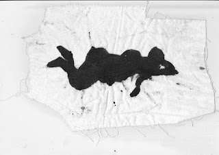
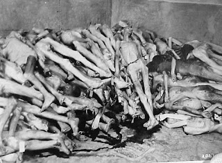
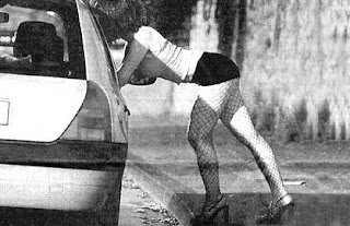
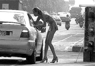
theses are some of my drawings and found images for my contribution